Normal UI: A Usability Technique For Non-Designers
I've been building web apps for 25 years. B2B, SaaS, eCommerce, intranet apps, and more. I've also been a UX designer for much of that time. I've run and watched hundreds, if not thousands, of usability tests.
That means I've been watching average users (non-developers) try to use web apps (without helping them) for over two decades.
You begin to see patterns in what makes a web app usable or unusuable under particular circumstances.
In this post I will introduce you to a technique that I developed over those years. It provides a simple, concrete framework to improve web app usability, is friendly to non-designers, often results in cleaner code and improved accessibility, and facilitates good UX and developer communication.
I call it "Normal UI".
(If you'd like to watch a video version of this post, I'm embedding it below.)
The Design Dilemma
There are two versions of a dilemma in web app design that I see devs dealing with:
- They don't have a designer to work with.
- They have a designer to work with, but "design" only means visual appearance.
The first case is often true with very small dev teams. Dev teams use UI component libraries, purchase templates, and do they best they can.
I've seen the second case quite often as well. Many web designers come from the graphic arts, and moved to web design to find employment. As a result their expertise lies in visual appearance (which is important), but not usability.
Sometimes the dev team prevents the designer from expanding their role. The designer may want to make usability recommendations, but the dev team only sees a designer's role as making what they build look pretty.
These situations are common. In both cases, the dev team lacks usability expertise.
I call this a "dilemma" because, these days, successful web apps are usable web apps.
Years ago, when people found an app hard to use they would blame themselves. They were always wrong. It was always the design. But, thankfully, times have changed.
Users, customers, clients, and stakeholders want a good user experience. When your app has good usability, you end up with more paying customers, happy users, and satisfied stakeholders.
In the 21st century, you need the web apps you build to have good usability. But here's the hard truth: using a UI component library or template does not guarantee that your web app has good usability.
You can have a brilliantly coded and beautiful button, but that doesn't matter if the user doesn't notice the button or if the words on the button don't make sense to the user.
Using a UI component library or template does not guarantee that your web app has good usability.
A straightforward way to think about usability is to think of a task in your web app. What are the series of action (usually clicks or taps or typing) a user has to take in your web app to accomplish that task?
At each step, the user has to out 1) figure out what action to take and 2) mentally process what is on the screen after they take that action. A fundamental aspect of good usability is ensuring that both of these steps are clear and understandable at every moment from starting to try and accomplish the task through to completing it.
We'll call this sequence of actions a user flow or workflow.
Getting this right is crucial to successful web apps. A beautiful app that's confusing or frustrating to use will not be successful.
But being able to consistently build usable workflows is a skill that must be cultivated.
I have found, however, that there is a simple framework to make workflow design decisions that consistently improves the usability of web apps. By "improves usability" I don't mean subjectively. I mean when formally tested with real world users, the results improve dramatically.
Normalization
Over the years as a dev, I've discovered that a useful metaphor for thinking through workflows (I won't use the term "user flow" any more, since in Normal UI I use a specialized simplistic kind of user flow I just call a "workflow") is database normalization.
A simplistic way to describe the concept of database normalization is that a table (or relation) that is normalized is more focused on a particular thing, and a denormalized table was less focused.
A normalized table of orders may contain an order date, but only an ID of the customer. A denormalized table may contain the order date and all the individual customer data.
The denormalized table is faster to get information from, but there is greater information density and therefore requires more mental effort to read through and find what you're looking for.
The same is true for workflows. A screen (that is a page or modal) has a finite amount of controls and information on it. Thus we say the more screens you visit from the beginning to the end of the task the more normalized that workflow is.
If you carry out various actions but stay on one or few screens we'll say that workflow is denormalized.
This is the core of Normal UI. You take tasks in your software, and decide between designing "normalized" workflows or "denormalized" workflows to accomplish that task. That is, you decide if the user mostly stays on one screen, or if actions take them across various screens.
Normalized workflows reduce cognitive load at each point, meaning how much the user has to take in and think about. Denormalized screens, on the other hand, can be more efficient for practiced users to accomplish tasks quickly.
You can draw these workflows. I draw squares to represent screens, circles to represent states of a screen (which I call "frames"), and arrows to represent actions the user takes.
When you draw a workflow, if you have few squares and lots of circles it shows the user stays on just a few screens while working, and thus the workflow is denormalized.
If, instead, you have lots of squares and few circles, that means the user is moving across various screens while working to accomplish the task. Thus that workflow would be considered normalized.
I say that you don't have to be a designer to use Normal UI. If you can draw circles, squares, and arrows, you can make some very important, impactful usability design decisions.
The concept of interface normalization gives you the framework you need.
A Concrete Example: Dangerous Workflows
With the notion of normalized versus denormalized workflows, I have found that you can make concrete recommendations on which to use when.
For example: dangerous workflows should be normalized.
What I call a "dangerous" workflow is something mission critical. A task the user performs that results in something impactful that cannot easily be undone.
A common example is sending a mass email. The sequence of clicks the user takes in your app to send a mass email is a "dangerous workflow".
By normalizing the workflow, we slow the user down, make the action more explicit, hand-hold them through where they might make mistakes, and ensure they understand the impact of what they are about to do.
For example we might have an invoice screen where you can click a button and send an email to customers who owe money on their invoices:
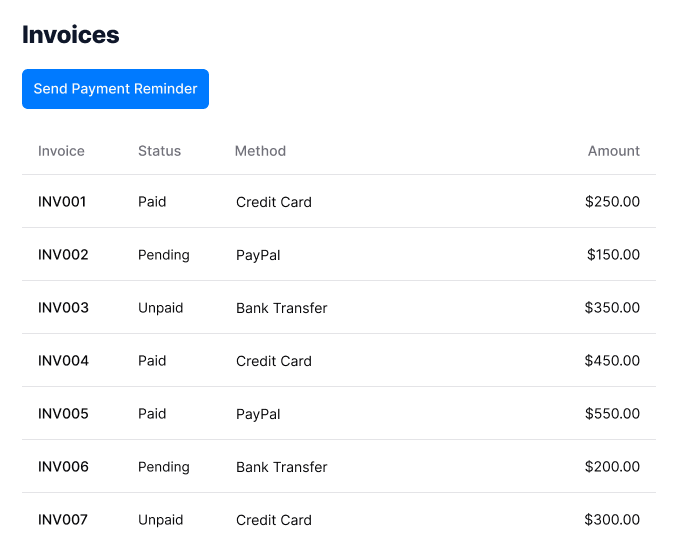
Once the user carries out this action it cannot be undone. You might have a confirmation popup after clicking the button, but after awhile users tend to blow through those without reading them.
If we were to draw the workflow diagram, it might look like this:

The user stays on one screen during the entire task. The workflow is highly denormalized. But, since it's a dangerous workflow, we normalize it.
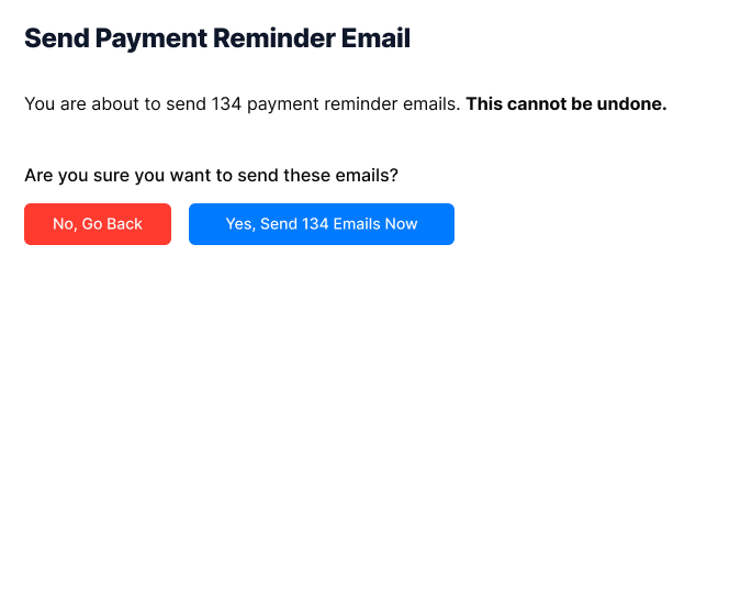
We spread the work across multiple screens. For example, after clicking the button they might instead come to a screen that looks like this:
If we were to draw the workflow diagram for the normalized version, it might look like this:

There are now more squares than circles. More screens than states.
We lower cognitive load and information density by normalizing the workflow onto multiple screens. In this case, on a new screen we can get the user's attention and focus them on the full impact of what they're about to do.
We can also make it easier to stop themselves from carrying out the action if they realize that isn't what they want to do.
We also give ourselves room to grow for new features, as software scope tends to grow over time.
But normalized interfaces aren't always better! In some cases denormalized workflows improve the practiced user's experience.
For example, if we were to add complex filtering to the invoices page, we may want a button to open the filters and show the filters on that same page. So filtering would be a denormalized workflow.
Some simple metrics, like how often the user uses the workflow (i.e. frequency-of-use) help define when to normalize and when not to.
Technical Benefits
I've also found there are technical benefits to thinking in these terms.
App Skeleton
A workflow diagram directly translates to the app skeleton. If you're using a JavaScript framework to build your app, then screens equate to routes (and sometimes modals) and states of the screen (the circles in the diagrams) relate to information being shown or hidden in a particular template.
Normalized workflows generally result in more, smaller route components, while denormalized workflows result in fewer routes but more components per route.
Accessibility
Native controls (i.e. those that are built into the browser) tend to be more accessible. When you normalize a workflow across screens, I have found you tend to use more native controls and less custom-built controls.
This is because you have the screen space to build straightforward UIs for complex UI cases that otherwise would have to be somehow squeezed onto busy pages.
Performance
Your workflow diagram also defines what can be lazy loaded in your application.
Whatever appears in the circles on your diagram, can be moved onto a lazy-loaded component. Squares are routes that can also be lazy loaded.
If you find a particular part of a workflow task is a performance hit, you can normalize it onto its own screen or screens.
This becomes even more true with a framework like Qwik, which automatically separates and lazy loads responses to clicks and taps (the actions in the workflow).
Thinking in terms of normalized and denormalized workflows doesn't just improve usability, but gives a way for devs and designers to talk about performance, file structures, clarity, cognitive load, bundle size, and efficiency.
The Book and Video Series
There's a lot more to share, but I hope you found this introduction to Normal UI useful.
I've considered writing a book on this subject for years. I have an old blog post from 2014 where I started, but never posted it.
After another decade of successful use of the Normal UI technique, I decided it was worth putting out into the world for dev teams to use. So, I wrote a book.

You can find the book at normalui.com. You also can bundle the book with the video series where I walk through using the technique to improve the usability of common web app features, as well as how to prompt an AI to implement Normal UI.
The book is a fast read, so you can start implementing Normal UI right away.
You can download the first 4 chapters free here.
Easier-to-use vs. Easy-to-use
Normal UI is about making your web apps easier to use. It doesn't replace usability and user experience expertise. It certainly doesn't replace usability testing and other forms of user research.
What it does do is give you a foundation that will result in strong usability improvements.
You'll have a way of talking about and thinking through your software that puts you in the mindset of your user and yields benefits by following a framework, instead of subjective opinion, which is what design discussions sometimes devolve into at dev shops.
An AI-friendly Approach
A funny thing happened shortly after releasing Normal UI as a technique. The AI explosion changed the coding landscape.
As it turns out, Normal UI works wonderfully in conjunction with generative AI. You can teach an LLM the Normal UI approach and terminology, and it gives you a vocabulary to guide an AI during UI generation.
I've found that it greatly improves the experience and output of iterating with an AI on a workflow. In the video series I give you a prompt to get you started.
Successful Web Apps Are Usable Web Apps
I hope this technique helps you build successful, usable web apps.
For myself, it's the culmination of 25 years of working in both dev and UX. The two disciplines are complimentary, more so than most dev shops even realize.
With the right frame of mind, and the right tools, you can reduce user frustration, user error, and design and technical debt.
Think normally.